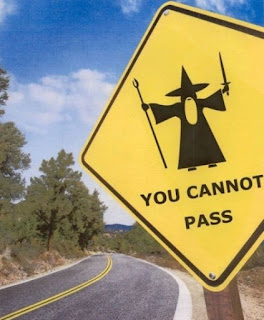
Russian graphic designers used to joke about how Americans live in a high way society. We don't digest images we pass them at high speeds, and if we can't read them in the moment they get ignored.
In an emergency situation you don't have time to ponder the meaning of a sign. You need to know quickly how to react. This is why the typography is absolutely necessary and can be critical in a life and death situation.
This looks cool, but if your doctor had to read the fonts in this quickly to determine your blood type these typographical choices are not the best.
The goal of the designer should be efficiency not confusion.
So we need to pick fonts that work. Sometimes a decorative font can work to be creative, but we need to address first who is our audience and what is the intended message for our audience.
Don't forget to design your sign!


No comments:
Post a Comment