Thursday, November 17, 2016

Book Cover Project!

     It's that time to start picking out a book for our Book Cover Project!

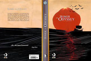
While you are looking for your film frame you also need to start researching a book to read that you will make a cover for. Here some examples of cool book covers...


Here is a list of books we need to design a cover for. You will need to read these books. We need start reading these books now, so when we begin the design part of the project we will be ready. So research and pick a book. Have a selection ready for me that you are going to read by the time we come back from break. 

You do not have to have read the entire book by then, but you need to have selected what you are going to read. Email me if you have questions.


  All American Boys by Jason Reynolds and Brendan Kiely

       An Ember in the Ashes by Sabaa Tahir

       Every Last Word by Tamara Ireland Stone

       Everything, Everything by Nicola Yoon

       Extraordinary Means by Robyn Schneider

       I Am Princess X by Cherie Priest and Kali Ciesemier

       The Making of a Navy SEAL by Brandon Webb

       Nearly Gone by Elle Cosimano

       Red Queen by Victoria Aveyard

       Simon vs the Homo Sapiens Agenda by Becky Albertalli

       Sweet by Emmy Laybourne

       A Thousand Pieces of You by Claudia Gray

       Untwine by Edwidge Danticat

       What We Saw by Aaron Hartzler


       The Wrong Side of Right by Jenn Marie Thorne

Monday, November 14, 2016

Commercial Art Boot Camp!


Hello there you dribble of paint! We are going to master the fundamentals. Unless you master the basics of digital painting you will be nothing more than a scuff on my dirt stained boot. 


How does light hit an object? Notice there are two different types of light sources. There is direct light which usually comes from the sun, lamp, moon, or flashlight. Then there is reflected light also called bounce light that shines from one surface to another.
We need to be able to paint the basics using value. So while this may be easy to draw...digitally painting this is can be quite difficult. It is important to understand that we keep the surface texture smooth. As much as we can mimic realistic textures the more we create believability for our audience.

The reproduction of these spheres not only demonstrates the power of Photoshop to handle different opacities with ease, but also allows for the artist to think about scale and atmospheric perspective. This creates believable depth for the viewer and mimics how distance appears to a viewer in real life.


Name Logos


We are working on name logos. Currently it is important to understand the interaction between Photoshop and Illustrator. Photoshop is a pixel based program that creates images using tiny dots of color. Illustrator is a vector program that utilizes plot points to harness rays of lights...think of geometry.

 Name logos are a way of us creating a brand for ourselves. It is important that we think about how we want to market ourselves. What do our logos say about us? How do we want people to think of us? Our branding should reflect the quality and expectations we want to reach for our clients while being true to who we are. 

 You are not locked into this branding forever, but it should have the intention of permanence for yourself and your client. Branding your name is almost like a first impression that like that first taste of food that either rewards your sensibilities or makes you gag.

Name Logos are due... Thursday, November 17th. 

Thursday, October 20, 2016

Fear Factor


In order to gain success we have to push through our fears of failure. As an extended jumpstart we are to draw something we are afraid of. The reason is that as artists, we are creators, who are in control. Your fears can't  harm you if you are creating a controlled environment for them. You can even make them silly. 

The point is that students are being taught that many of the things we feared when we were small we no longer fear because we learned to gain control of those things in our lives. Such as, if you fear the dark, when you get older you simply turn on the light switch. The light switch we are using in our classes is our minds.

Friday, September 23, 2016

Typographical Movie Quotes


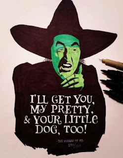
We are designing typographical movie quotes that reflect the voice and the story that the film is trying to convey. Students are to carefully select typography that fits the themes reflected in their movie choice. They should use good reference from sites like ...


The finals typography images are due Monday the 26th. 

Here are some great examples...


Sunday, September 11, 2016

Typography is Important!


Russian graphic designers used to joke about how Americans live in a high way society. We don't digest images we pass them at high speeds, and if we can't read them in the moment they get ignored.


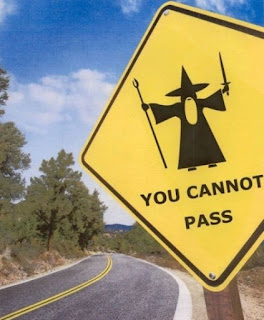
In an emergency situation you don't have time to ponder the meaning of a sign. You need to know quickly how to react. This is why the typography is absolutely necessary and can be critical in a life and death situation.


This looks cool, but if your doctor had to read the fonts in this quickly to determine your blood type these typographical choices are not the best.


The goal of the designer should be efficiency not confusion.


So we need to pick fonts that work. Sometimes a decorative font can work to be creative, but we need to address first who is our audience and what is the intended message for our audience.

Don't forget to design your sign!


Tuesday, September 6, 2016


Your self-portrait as a character is due on Thursday! Don't forget!

Sunday, August 28, 2016

Discover!


We live in an typographic world, where typography exists all around us. In class, we discussed how your choices of typography that you enjoyed. We explored why you chose these fonts, how they were eye catching, and what they communicated.


Next, for homework we discussed how you were to find typography that fit your personality or style to create a typographical design using your name. Have fun being creative and expressive. Your typographical choices should reflect your personality. Here are some examples for the name Jackson:


Monday, August 22, 2016

Intro Typography!


Welcome to typography! We are beginning our adventure into the world of typography to compliment our exploration into digital design.

Typography is all around us. Ultimately, typography is the greatest expression of how art is communication. But what is typography exactly?

typography

  1. 1:  letterpress printing
  2. 2:  the style, arrangement, or appearance of typeset matter

  3. Homework:

  4. I need you to find 3 examples of typography that you can put into a powerpoint that capture your attention. Be prepared to explain your choices.


Friday, August 19, 2016

Who are you?


The problem with doing most self-portraits for young artists is the same for old artists too. We are still figuring out who we are. Are we defined by our friends, our beliefs, or what we do? This isn’t a simple answer.


So a solution to this problem is figuring out what fictional characters do we identify with. The reason this is helpful is because if we identify with a fictional character, we can ask ourselves what about that character resonates with us. Do you ever feel the crushing pressure of responsibility as Game of Thrones character, Jon Snow? Are you the uneasy, humorful, but ultimately caring, FN-2187, from the Force Awakens? Maybe you see yourself as cynical, aloof, and strong as Jessica Jones?


We love television, movies, and videogames. As artists these types of media are fuel to our imagination. What we love about this entertainment that we need to contemplate is that it may reflect a part of who we are. Ask yourself what about that character’s story that you feel is also your own. 


Monday, August 15, 2016

Find 3 Self Portaits


Find 3 self portraits that appeal to you. Save a copy of these images and write who the artists are. Now analyze why these pictures appeal to you. Are there trends that link the images? For example, are all the images you pick brightly colored or do they have pets in them. Find the correlations. 

Friday, August 12, 2016

Self Portrait Introduction


Today we explored expressing who we are if we were completely mute. Another way to think of this prompt is to imagine if you were trying to communicate with someone who did not speak the same language. A universal way of communicating might be through art.

 Art is a visual language. What signs or symbols would you use to express who you are without the ability to speak? Draw an image or images that would relate who you are.


In addition, we in class today discussed Miyamoto Musashi. He was of Japan's most historically significant samurai. The samurai warriors traditionally also mastered another trade. Often their choice of mastery was artistic to be a balancing accompaniment to their perfection seeking with the bow or sword. Musashi, was a dedicated author and artist. This is an example of one of his self portraits.


Monday, August 8, 2016

Welcome


Welcome students to Braden River Art's Blog!

In this blog you will be able to link to class assignments, find explanations of projects, gain access to reference materials, and advanced classes will be able to post assignments. I'm hoping this will further reflect the professional world and make your learning environment even better. 

Make sure you download and print a syllabus from…


Also, please check out our gallery site at